

Time: 2 months (100 hours)
Role: UX Researcher
Team: 10 individuals spanning marketing, customer service, copy, and product manager
Tools: Figma, Octane
Platform: Mobile and Desktop
LAUNCHED NOVEMBER 2022

Challenge
New concealer launching online and customers are not sure of their shade as there are more shades offered. Customer service needs a tool to assist customers find their shade before reporting to them. The challenge is to stay in the budget and help customers find their shade.
solution
Utilize Octane to create a quiz that helps customers find their shade without going over budget.
IMPACT
93% Increase User Engagement
75% Increase in Revenue
50% Increase in user retention
40% Increase email subscriptions
20% Increase AOV


DEsign process


Empathize
Research goal
Improve user experience by finding their shade and recommending products they may be interested in. Understand how customers find their shade online.
Competitors

Fenty BEAUTY
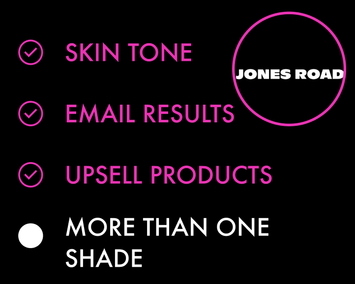
jones road

nars
competitive insights
-
Opportunity to develop shade finder that emails customer their result and grow email subscription list.
-
Opportunity for effective data gathering to utilize for the customer experience to incentivize users to purchase products that go with their concealer.
-
Opportunity to suggest more than one shade in case the first recommendation is wrong to further suggest products customer can purchase.
User Survey and findings
I created survey questionnaire for stakeholders and users to prioritize which questions for the quiz were essential to finding a customers shade without overwhelming them.
7 out of 10 said they find images to help the most when seeing if they match the model’s skin tone.
70%
10 out of 10 said they would prefer to have more than one shade recommended in case the first one is incorrect.
100%
Informative
I found this to be a common theme in competitors' shade finders to inform customers about their under tone and skin tone and to use images to show what the product looks like on someone.
Incentivize
Customers want to be recommended products that will go with their concealer to complete the look. Including a question for their finish preference is important as there are multiple ways to complete their look.
Seamless Experience
Users are very passionate about the overall seamless experience using an online shade finder to help find which color they should get.
However, when the incorrect shade is given to them users feel upset and are frustrated to take the quiz again.
Efficient
The pain points were mainly with customers having too many questions to answer. The shade finding experience should be efficient. Customers want their shade to be emailed to them to be a reference point for later.
Impactful ideas
-
I would like to explore ways to have a seamless and efficient reporting system in the Citi Bike app.
-
I would like to explore ways to inform users and build customer loyalty to the brand and want to continue shopping on the site.
-
I would like to explore ways to efficiently provide users with their information and ask them as little questions as possible.
define
Utilizing user surveys, competitor insights, and user journey map to ideate and define impactful ideas to explore solutions for Milk Makeup customers.
User Journey map

I created a user journey map to point the user highs and lows of the current shade finding experience shopping on milkmakeup.com. I emphasized the points when the user may not be sure what shade to get and their thoughts.
Scenario
User wants to find their shade when purchasing a tinted product online and realizes it is the wrong shade purchased when it arrives.
Expectation
User wants to get the right shade and not have to return their product.
HMW Questions
How might we prompt users not sure of their shade seamlessly on the site?
How might we match users with the correct shade?
How might we incentivize users to use the shade finder?
How might we promote users with other products that interest them?
User Personas
I created two user personas one customer that is not sure of their shade and another taking the quiz for fun.
overview
Looking for
They are both looking for a seamless and efficient experience on the website. They are looking for looking for an efficient and fun way to find their shade and get product recommendation and information.
Experienced Makeup Artist
“I am always looking for new makeup products.”
Makeup Newbie
“I am new to makeup and i want to learn what my shade is.”
Expert Makeup artist
-
Motivations
Motivated to see what new products Milk Makeup has and have a fun time learning about her skin tone. Wants to have an efficient and painless time answering questions.
-
Core Needs
She wants to find new products and be informed about what she could purchase. She is a big fan of the brand and loves all their products. As a loyal customer she would appreciate a discount if offered.
-
Pain Points
Too many options to choose from on the site would love to be recommended items she may like.
Makeup Newbie
-
Motivations
Motivated to find her perfect shade and have a great experience shopping on Milk Makeup’s website. Wants to have an informative and frictionless experience to find the right product for her.
-
Core Needs
Tia wants to become a loyal customer but needs support to earn her loyalty. She needs to understand what she is purchasing and get the right help to make the process easier.
-
Pain Points
Not having the information she needs seamlessly and not having a step by step process when a problem arises.
Solution
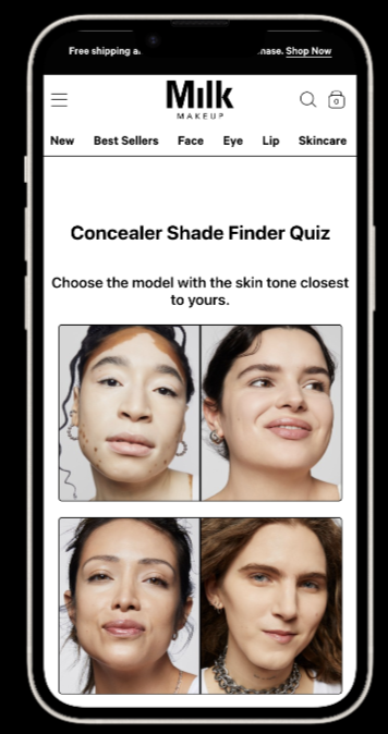
Create MVP feature on site that is a quick and informative quiz for customers to find their shade for new product launch.
Ideate
The questionnaire should be quick and easy and keeping this flow as simple as possible was the main objective. Communicating with the user during this flow with imagery was essential.
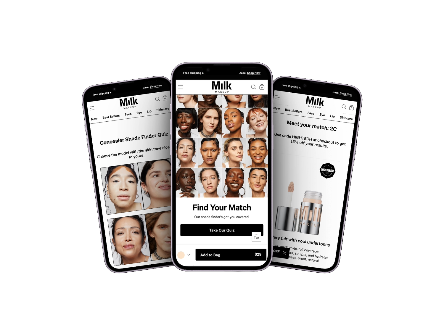
user flow 1: Finding Shade

user flow 2: Results
To get the right products recommended that matched their skin tone involved a matrix of which products were for certain answers submitted. The flow guides the user on what shade they should be and then upsells products to go along with their shade as well as the look they are trying to create.

1. Finding Shade
Allowing users to answer questions that engage them and provide insights to the shade they should purchase.


2. Shade results
Users finding their shade and having the ability to see product recommendations and other shades that may be for them increases AOV and reduces bounce rate.
Customers are then emailed their results to save for later. Furthermore, an email journey is prompted on Klayvio to inform customers more about the product.


test
User test Results
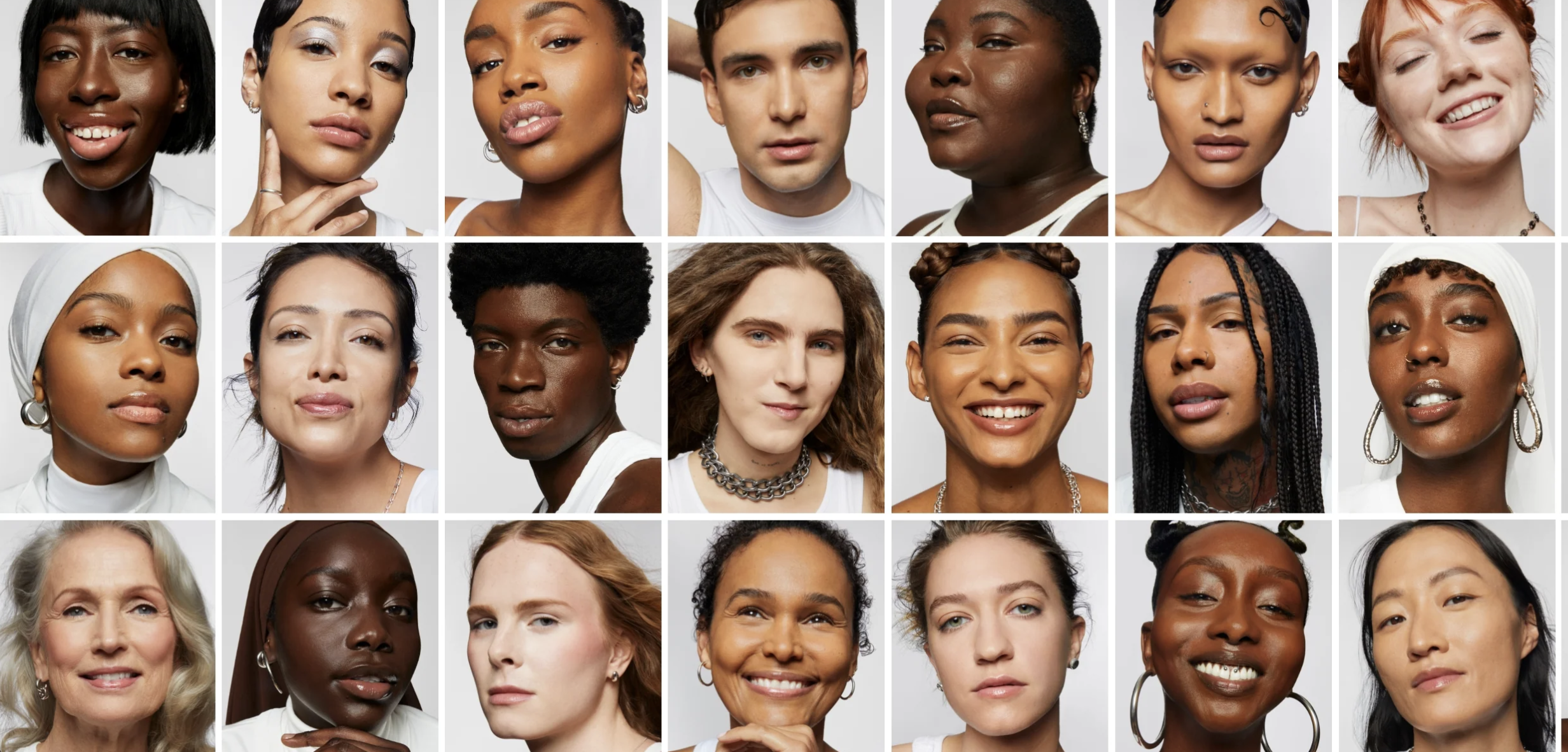
Overall, the quiz had a high error rate and users said that they were not getting the right shade recommended. The iterations that were essential to make were to change the first question selection of models to show a broader range. As well as the third question that asked for the customer’s undertone; which needed to show models that matched this range as well and to include information about the undertones.
- Yes
- No
- Yes
- No
8 out of 10 users struggled to find their shade that matched them.
80%
10 out of 10 users appreciated the jewelry question they said it made the quiz interesting.
100%
Iterations
I tasked users with the goal of finding their shade and being informed with their result.
Observing each user, I noticed areas where the user seemed visibly happy with their experience, as well as a few areas of hesitation.
This allowed me to determine what was working and what needed to be updated.


A few testers got stuck on this screen while trying to choose which shade range to pick.
I briefed the creative team to have a separate photo shoot to utilize natural lighting for the shade finder images. Re-testing this screen yielded stronger results with a 100% success rate and a task completion time 5 seconds faster on average.


We had limited space to inform customers all the shades we had. Finding the perfect range for shades that were similar for customers to choose from was challenging.
I researched all the shades provided and meeting with our makeup artist and product innovation team to understand which shades could go together.


In case the shade recommended to customers was incorrect or customers were in between shades having the iteration to recommend two shades in their range was necessary for optimal success.
After researching the proper shades in the correct ranges I was able to update the matrix of the quiz to provide customers with product recommendations. Re-testing this screen yielded stronger results with a 100% success rate and an increased AOV of 25%.
Final prototype
The final prototype was a success after revising the prototype for the case study.
IMPACT
93% Increase User Engagement
75% Increase in Revenue
50% Increase in user retention
40% Increase email subscriptions
20% Increase AOV

next steps
Conclusion
In conclusion designing a new feature to the site was rewarding. I had a lot of knowledge on the Milk Makeup products and wanted to help improve the site and customers experience as they shop. The prototype was a success and I was able to inform my designs from the users I interviewed as well as the findings I found during my competitive research. We launched the site on time with the product launch and it was a success!
future considerations
The next steps of this project would be find where customers bounce off of and update the images of models to show a more true skin tone.